Proportional and Non-proportional Fonts
A proportional font uses varying widths to display each of its letters and symbols, while a non-proportional font uses the same fixed width to display its characters.
Some of the most popular proportional fonts are Times New Roman, Arial, Verdana and Georgia. Most people find these types of fonts easier to read and more aesthetically pleasing than non proportional fonts, which is why they appear more frequently in published material.
Non-proportional fonts are mainly used for formatting purposes. When characters need to be lined up neatly in fixed columns, a non-proportional font such as Courier or Monaco can be used. Old fashioned typewriters and early computers used fixed-width fonts exclusively.
Why? Because the early typewriters used rollers that moved to the left every time a key was pressed, and since they had no way of determining which key was going to be used next, the roller had to move a fixed amount of distance to allow room for the next letter; thus the characters all had to use the same amount of space.
Early computers also used non-proportional fonts so programmers could display graphics easier. Because every object on the screen would be a fixed amount of distance away, they could plot out things much easier in their programs. And programmers still use non-proportional fonts today since it’s easier to distinguish certain characters with them. Examples of non-proportional fonts are Fixedsys, Prestige Elite, ProFont, and Angelus III (the latter is rather unusual since it’s a ‘handwritten’ looking fixed-width font).
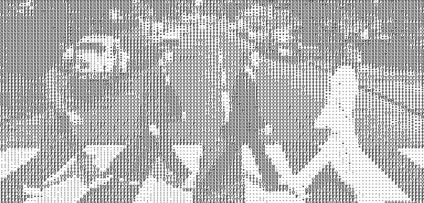
Another use for non-proportional fonts is in ASCII art, which is a text based art form presented on computer screens made with the simple ASCII-based character set. ASCII stands for ‘American Standard Code for Information Interchange’ and is a system of character encoding that uses the English alphabet. It is used to display text in computers and other electronic communications equipment.
ASCII artists arrange these characters into pictures for display on computer screens, and the medium relies on non-proportional fonts so everything will line up properly; and so the same image can be seen when viewed on different computer platforms.
Numbers that enjoy certain properties, such as primality or being a square number, and that also contain some type of visual component is a concept closely related – in my mind at least – to that of “concrete poetry,” which is also related to ASCII art.
Poems dubbed “concrete” are those in which the typographical arrangement of words or symbols plays a direct role in conveying the “meaning” of the poem. A famous example is George Herbert’s (1593-1633) poem “Easter Wings” in which its two stanzas are wing-shaped. Concerning “concrete mathematics,” there is of course no meaning to relate in the numbers presented. However, there is an element of humor in finding numbers that have various figures “pictured” in their digits when formatted in a certain way.
So there you have a few of the differences between proportional and non-proportional fonts.
Discussions — No responses yet